Word Study Application
Context
A personal project born from a real frustration: most language apps demand too much time and don't fit into the small gaps of a busy day. I wanted to design something fundamentally different — shorter, fast, word-first.
Problem
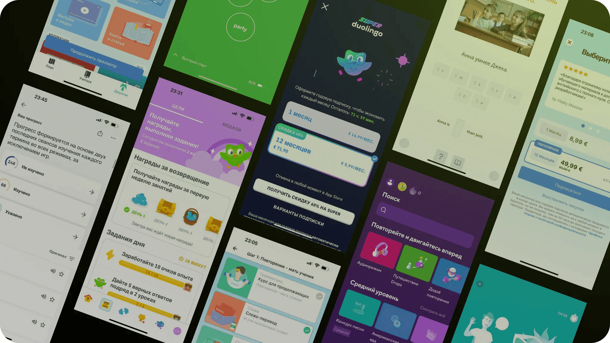
Popular language-learning apps like Duolingo, Babbel, and Lingvist are built around sequential lessons that take 10–20 minutes. They were not designed for a busy person, but don't fit the real rhythm of a busy person 2–3 min between meetings, waiting in line.
At beginner levels, vocabulary predicts reading comprehension more strongly than grammar. Focusing on words first delivers fast, tangible results — and keeps motivation high.
Target Audience
Adults learning a language under time pressure. Not students with hours to spare, but people who want to build a solid base — quickly, without friction, and offline.
Benchmarking
I analysed the main competitors and found consistent patterns:
- Lessons are designed for 10+ minutes — not suited for micro-sessions
- Offline mode is either absent or heavily limited
- Extra content (songs, stories, texts) scatters focus
- Most apps are built for learners starting from zero, following a fixed curriculum
There was a clear gap: offline-first vocabulary training for people already learning — almost no one owns this space.
Hypotheses
Five key hypotheses shaped the design direction:
- Short vocabulary sessions (1–3 min) work better than full lessons for time-constrained users
- Micro-format increases usage frequency — easier to fit into any moment of the day
- Offline mode is critical for an on-the-go audience
- Minimal content with no extra sections helps users stay focused and feel real progress
- A free model lowers the barrier to entry and allows early concept validation
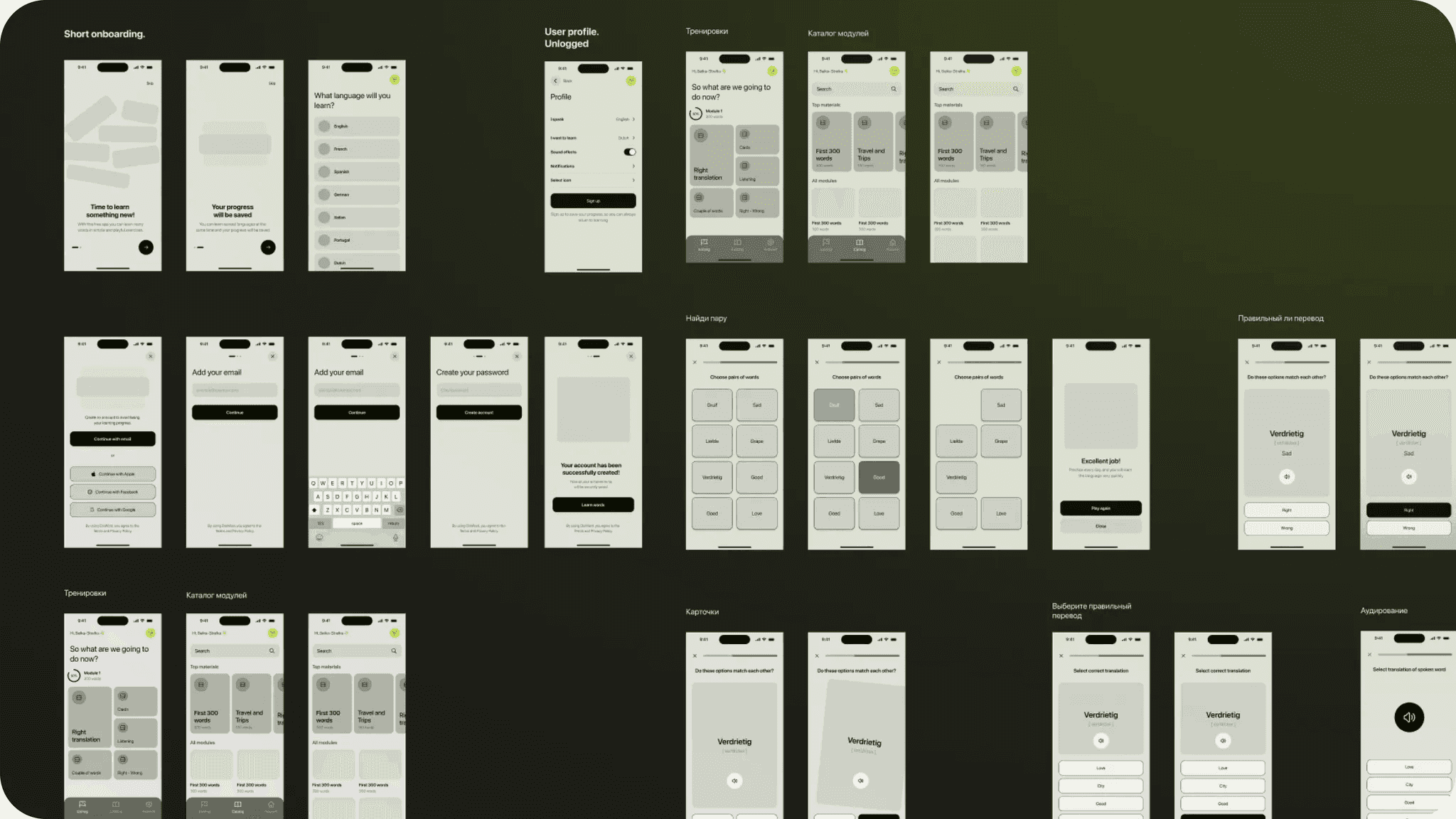
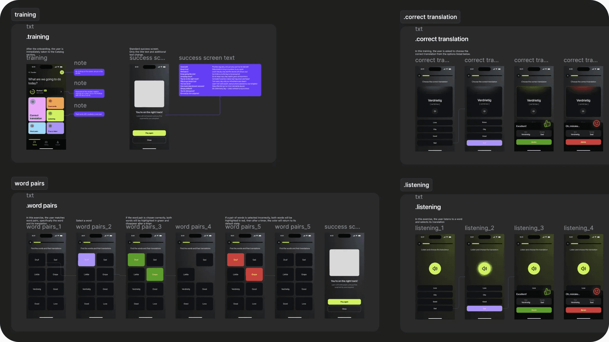
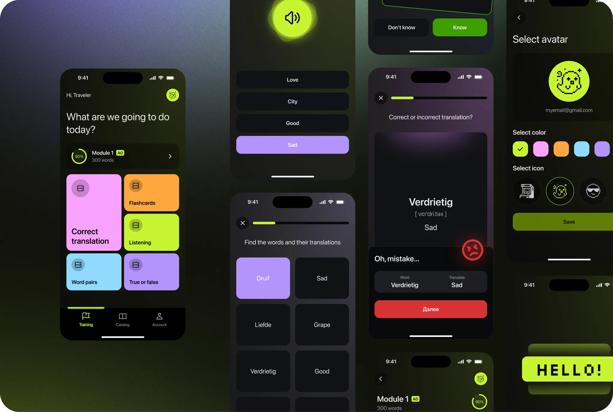
Design Decisions
I adopted a mature visual language — modern and minimal: dark tones, clean typography, no animated characters — deliberately rejecting competitors' cartoonish approaches.
The interface follows a streamlined workflow: select a topic, complete training, review outcomes. Unnecessary features were eliminated.